LabSafe Metrics is a technology startup that utilizes artificial intelligence and machine learning to launch new drugs and business activities from the clinical phase. Its mission is to reduce drug shortages and improve patient access to medications.
As a team, we were tasked with the mission of designing an MVP (Minimum Viable Product) of a desktop dashboard that allows visualization of data corresponding to the sales forecast and current and future stock of medications before and after their launch.
2023 – LabSafe Metrics
Methodology: Design Mindset, Product Planning, User Experience Studies, Ideation, Interactive Design
Toolkit: Figma, Illustrator, After Effects
Introduction
Analyzing the pharmaceutical sector, we discovered that sales and marketing teams within pharmaceutical companies were having difficulty visualizing and comprehending data related to sales, stock, and marketing campaigns. The project's objective was to create a UX/UI dashboard that would allow users to easily access data and make informed decisions based on it.
Problem Description
During initial engagements with pharmaceutical companies and LabSafe Metrics itself, it was observed that data visualization posed a significant challenge. Additionally, the software utilized to access the data was outdated and not very useful.
In essence, our users needed to find sales forecasts and their comparisons in one place to make optimal decisions.
Research
The research focused on better understanding the needs and expectations of the users. Our goal was to:
Identify current user behaviors
Determine what information was necessary for decision-making
Understand the importance of Information Architecture (AI)
To achieve this, in-depth interviews were conducted with 10 individuals in pharmaceutical sales and marketing roles. The interview included an open card sorting exercise that allowed us to name and organize different KPIs, as well as gather data on specific challenges users faced in visualizing and comprehending the data.
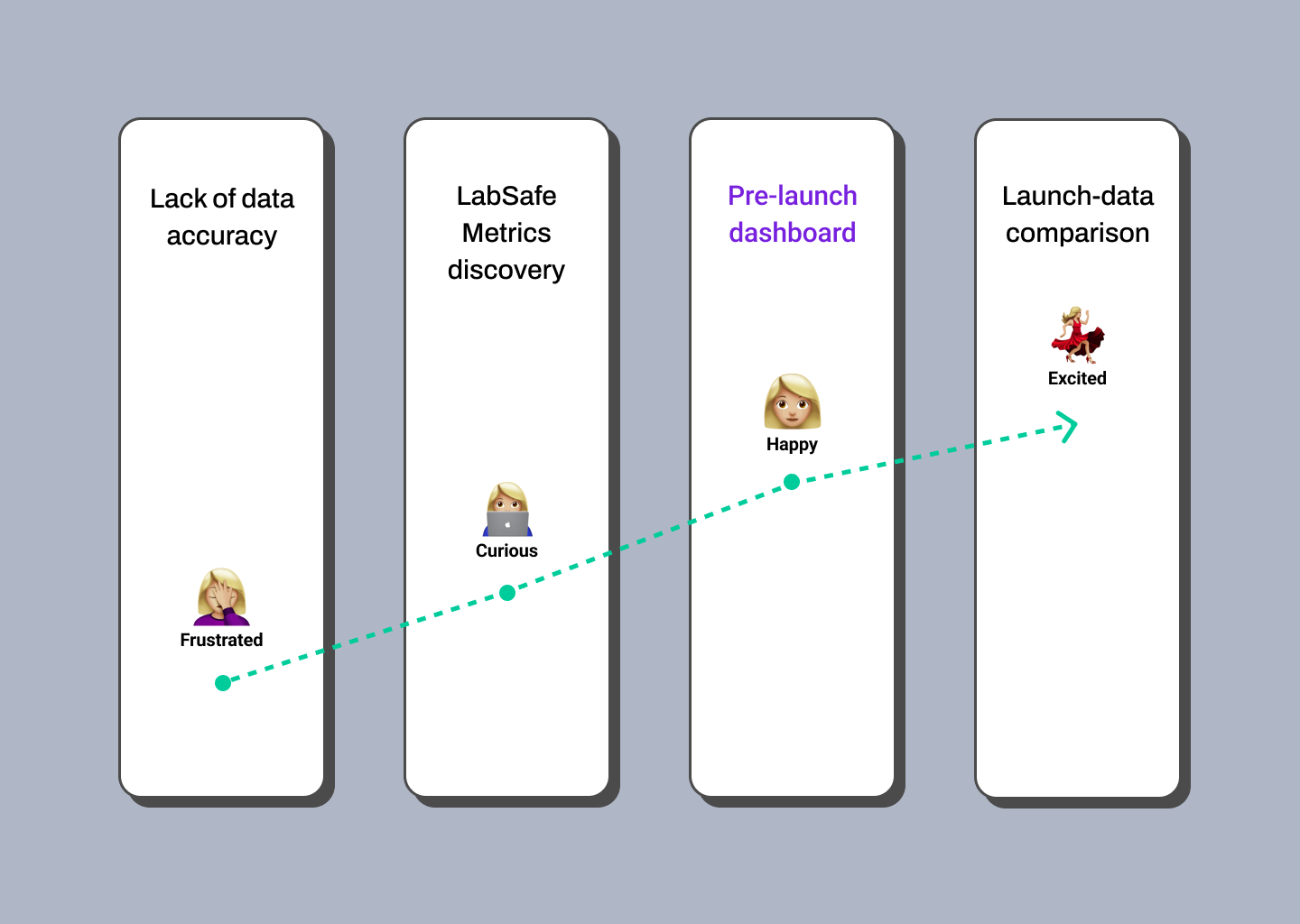
This enabled us to create a user persona that embodied the real problems and insights from the research. Our users needed to find sales forecasts and their comparisons in one place to make optimal decisions.
Defining the use cases allowed us to determine the functionalities that our MVP could contain, and the MoSCoW method helped prioritize the requirements and tasks it should fulfill. With the help of this user persona, the user journey that would guide the project was defined.
close
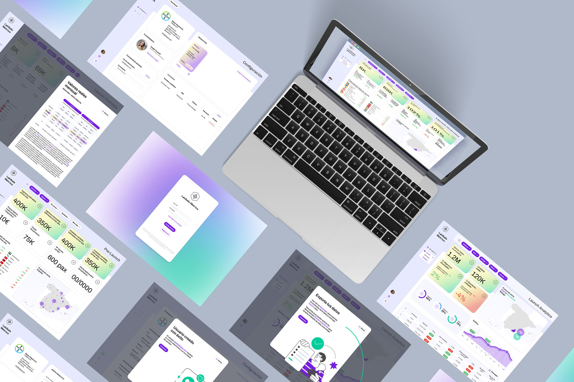
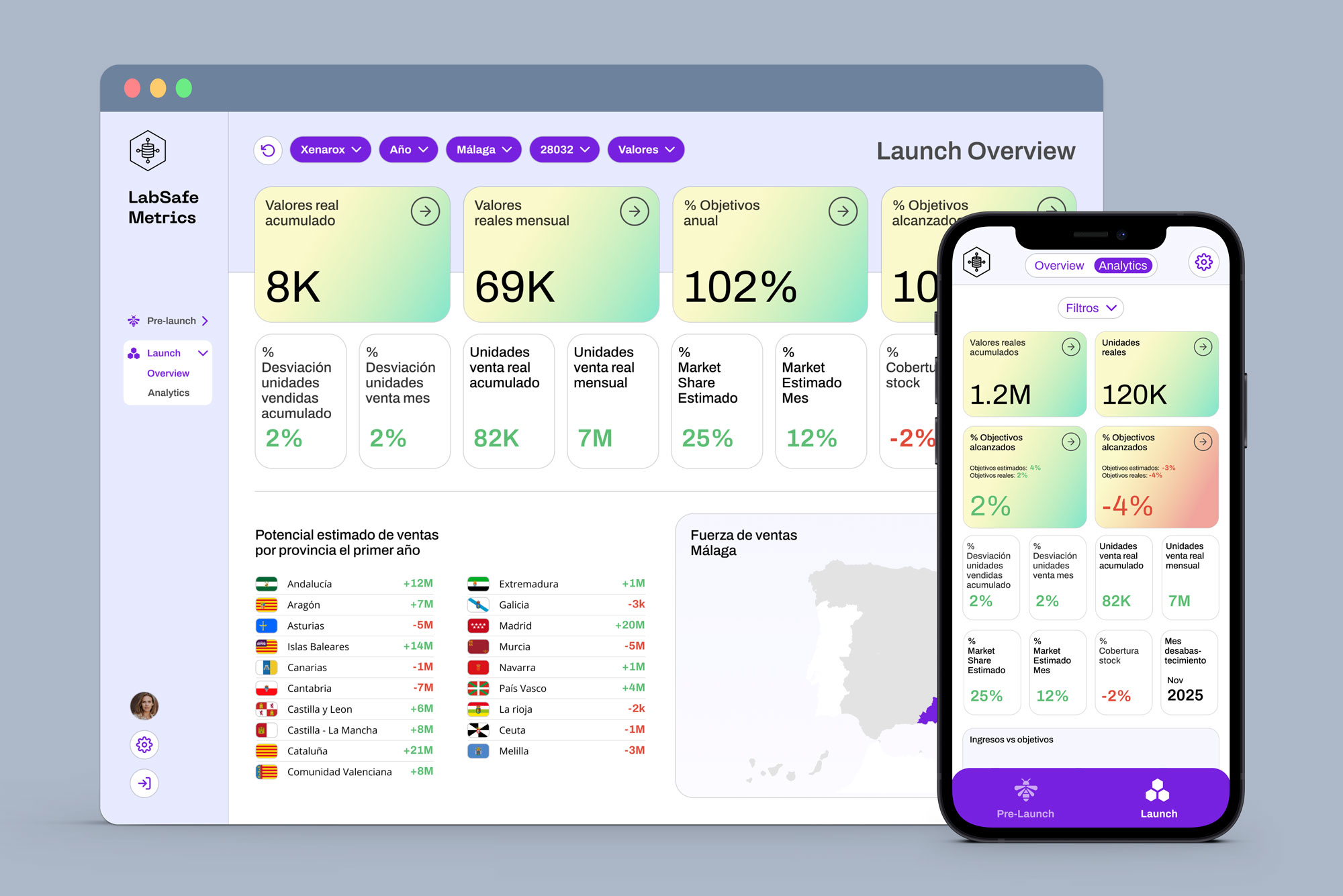
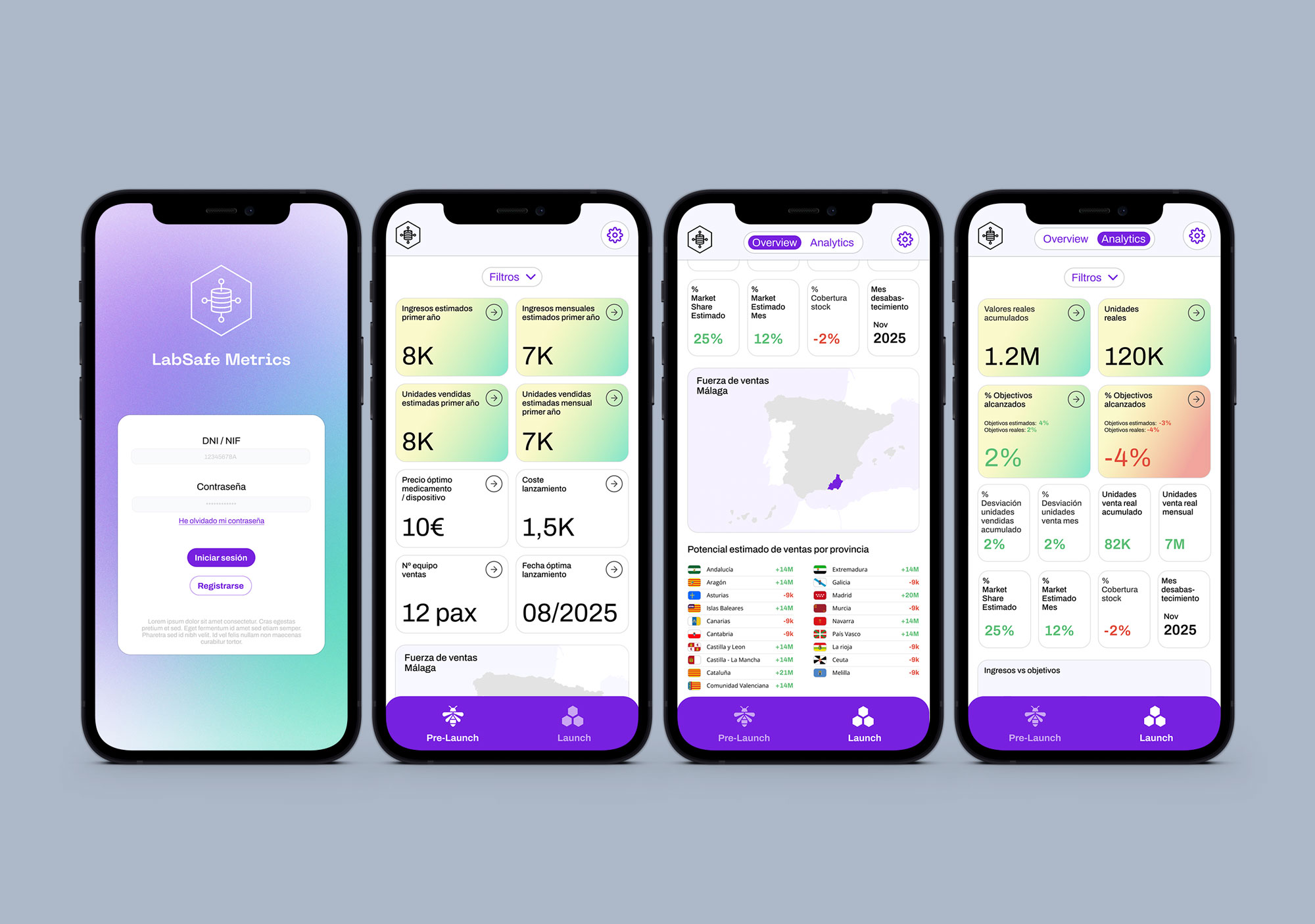
Solution
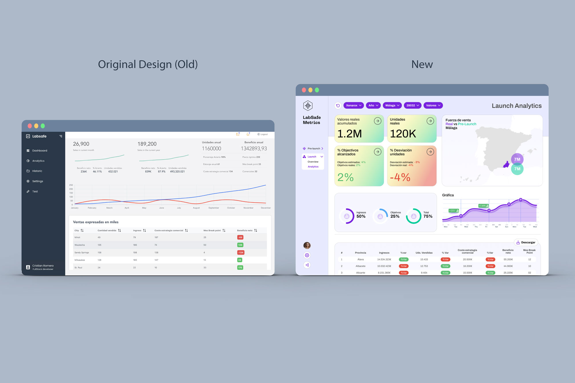
The proposed solution was to design a UX/UI dashboard that allowed users to visualize sales data by communities and healthcare codes, as well as stock prediction and campaign expenditure, in a clear and straightforward manner. It focused on usability and making information easily accessible and understandable for users.
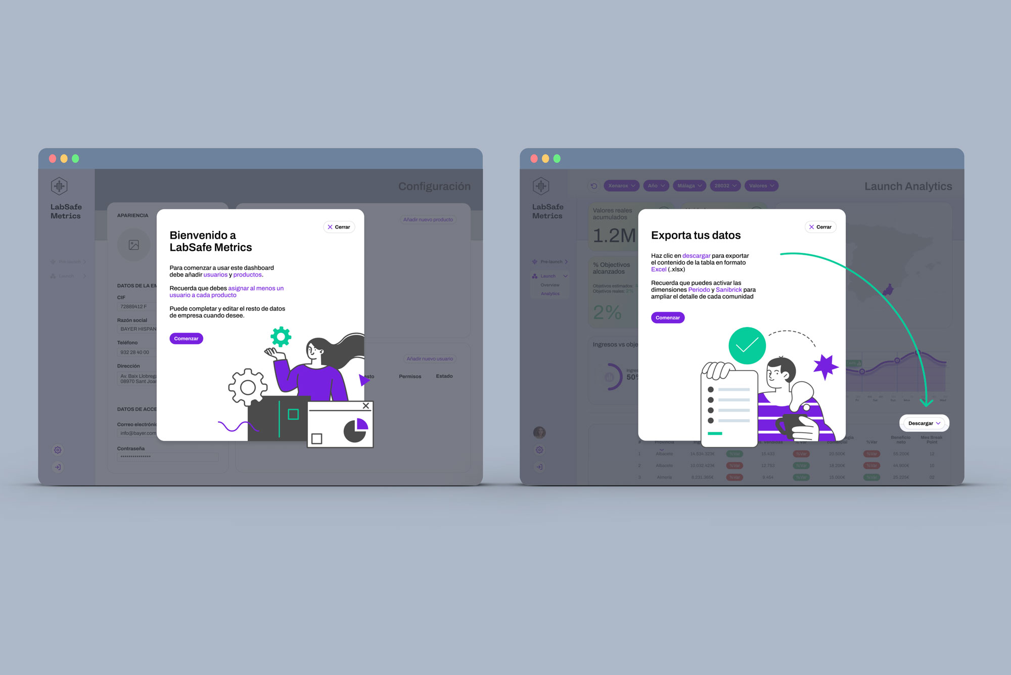
To achieve this, a modular design was proposed that allowed data to take center stage and be highly visual. Thanks to these modules, the dashboard could be easily adapted to any format; minimal design changes were needed to create a mobile version from a desktop format.
Additionally, users were given the ability to compare their data with historical data and that of other communities. The dashboard also allowed users to customize their views to suit their specific needs.
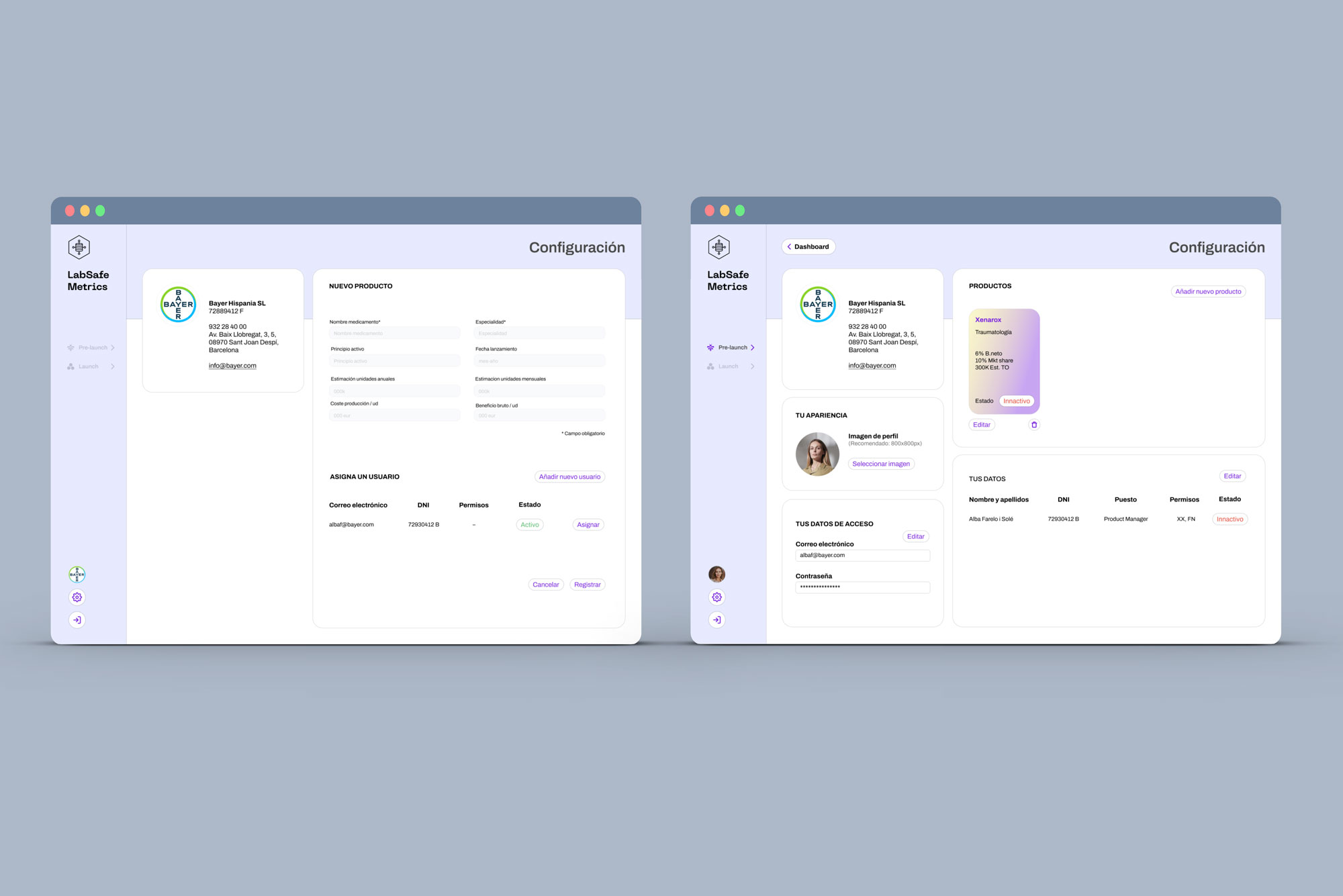
Profile settings for both company and user were redefined to provide greater control over products and their administrators.
close
close
Users noticed excessive spaces between job listings, causing confusion and inconsistency in the experience. It was recommended to reduce these spaces, especially in areas where no ads were displayed. Additionally, the overwhelming number of irrelevant ads overwhelmed most users. It was suggested to display ads only when they were relevant to the user's intent to enhance the experience.
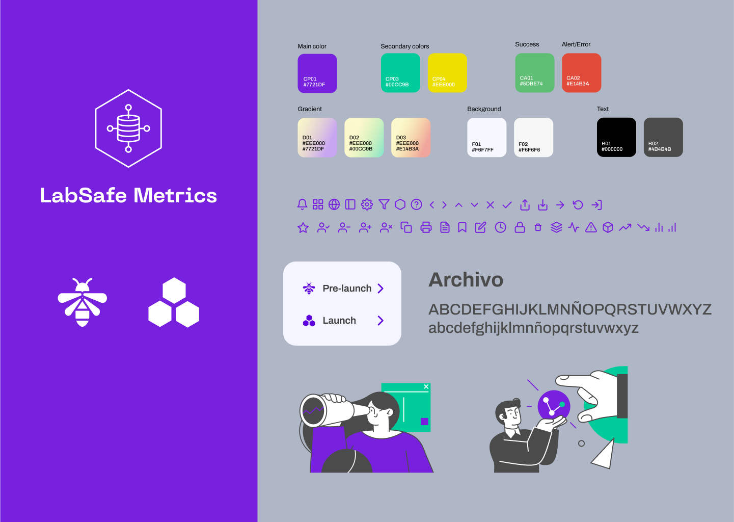
Style Tiles
A style tiles was created to provide consistency and coherence to the brand across both the web app and mobile app.
Implementation
The dashboard improved the efficiency of the sales and marketing team by providing clearer and easier-to-interpret information. It enabled the company to make informed decisions based on sales data, leading to an improvement in the sales and marketing strategy.
Results
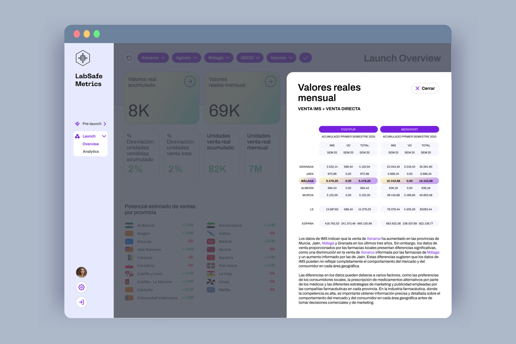
The dashboard was designed in Figma to allow for testing before proceeding to development. During implementation, some technical issues had to be addressed, but these were effectively resolved. This included creating a sidebar sheet to expand the values of the KPIs and the ability to download all documentation in PDF format.
Conclusions
The project was a success thanks to the focus on user-centered design and attention to usability and accessibility. The dashboard significantly improved the user experience and enabled the company to make more informed and strategic decisions.
Next steps
Conduct usability tests with users to identify any issues or areas for improvement.
Adjust the dashboard design based on user feedback received.
Ensure that the technical implementation of the dashboard is complete and without issues.
Train users in using the new dashboard and ensure they feel comfortable using it.
Track the results and impact the dashboard has on the company's sales and marketing strategy.
Learnings
1. The importance of user-centered research (Service Design): Research is essential for understanding users' needs and expectations and for designing solutions that meet those needs.
2. Usability and accessibility are critical: In this project, the difficulty of data visualization was a significant challenge. The user-centered design team was able to address this issue by making information more accessible and easily understandable for users.
3. The importance of visual design: The dashboard was designed to highlight data and make it highly visual. Good visual design can significantly enhance the user experience and make data easier to comprehend for making informed decisions.
4. Collaboration between design and IT teams: During implementation, there were some technical issues that needed to be addressed. Close collaboration between design and IT teams is essential to ensure effective and smooth implementation.
Track the results and impact the dashboard has on the company's sales and marketing strategy.
5. The importance of feedback: After implementing the dashboard, it's important to gather feedback from users to identify any issues or areas for improvement. Testing allows for user feedback that can help further improve the user experience and ensure that the dashboard is meeting its goals.