LabSafe Metrics

LabSafe Metrics is a technology startup that uses artificial intelligence and machine learning to launch new medications and commercial activities from the clinical phase. Its mission is to reduce medication shortages and improve patient access to drugs.

The team was commissioned to design a desktop dashboard to allow the visualization of data corresponding to the sales forecast and current and future stock of medications before and after their launch.

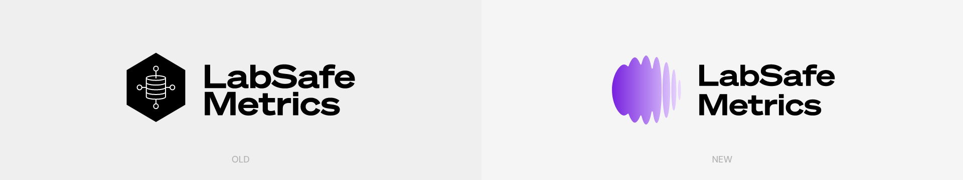
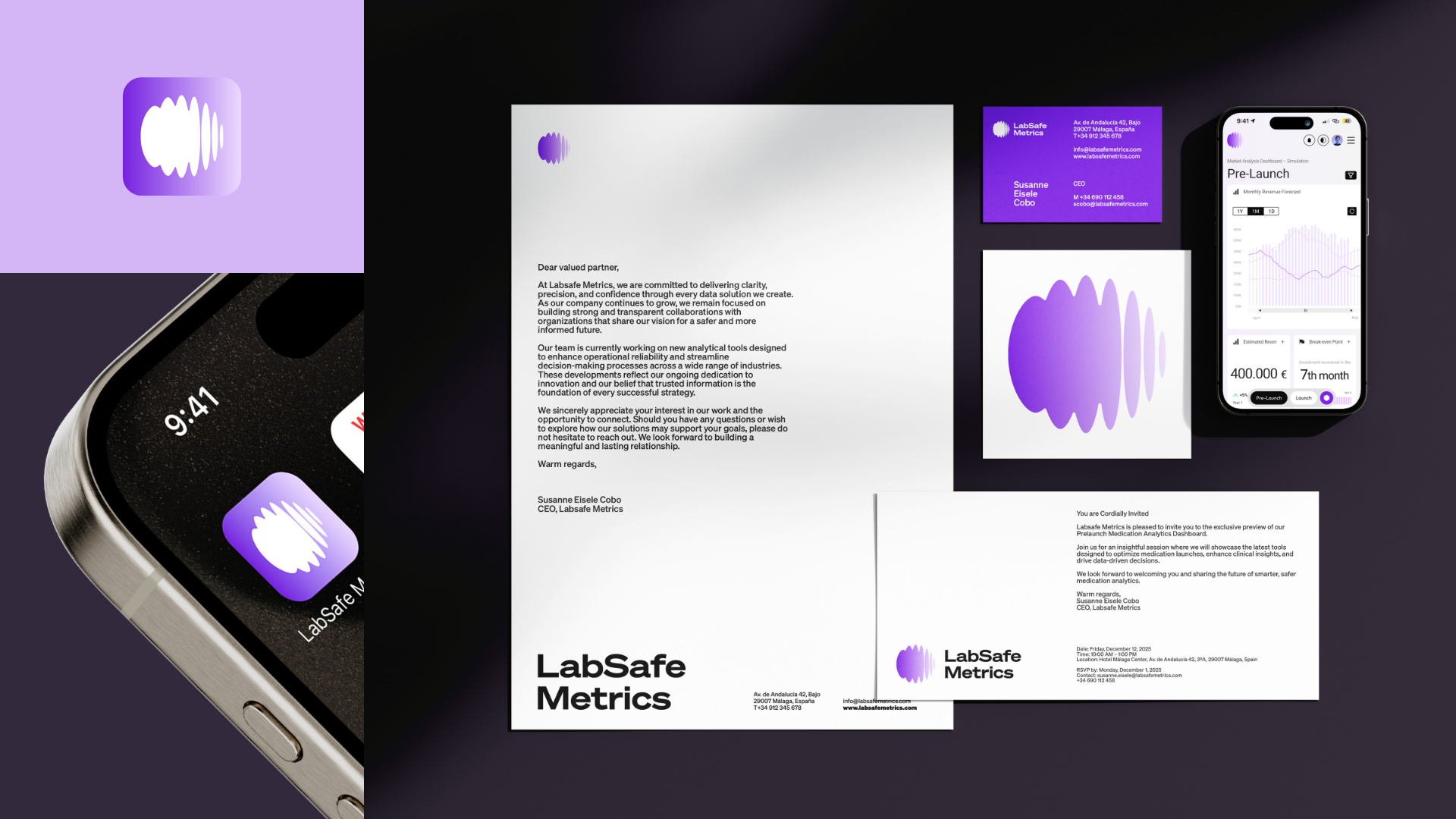
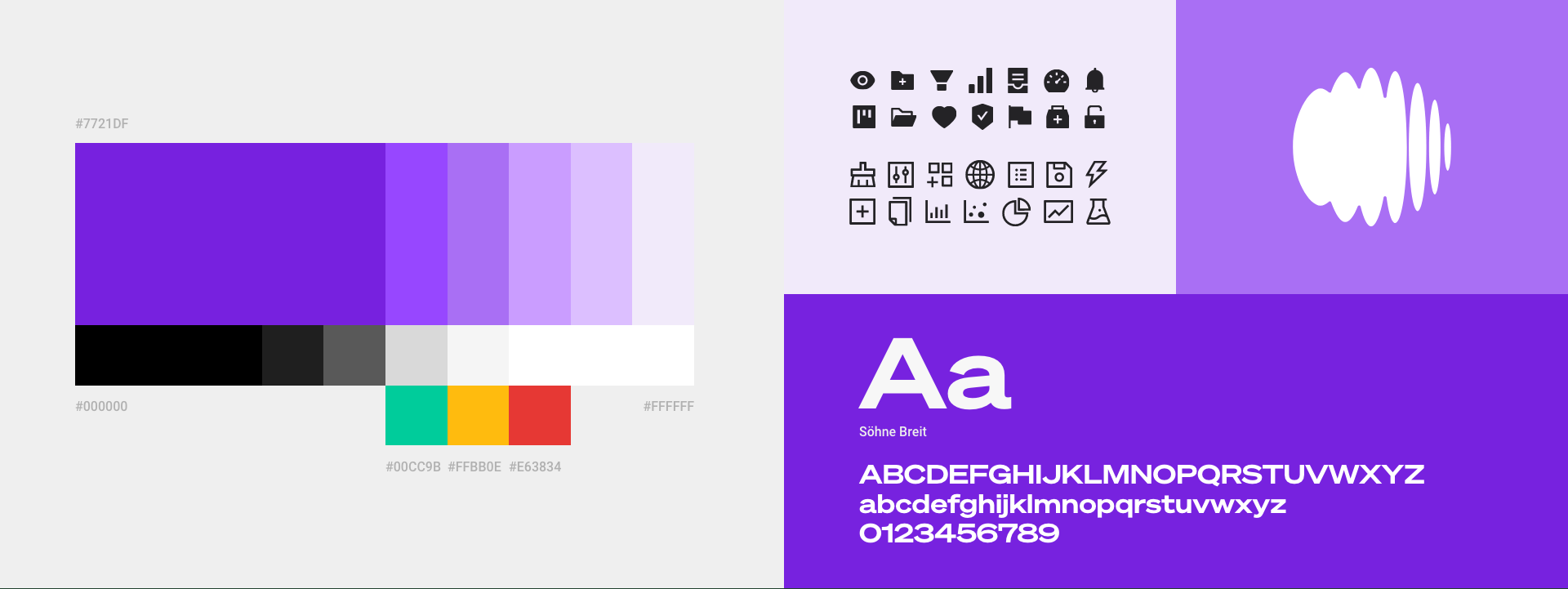
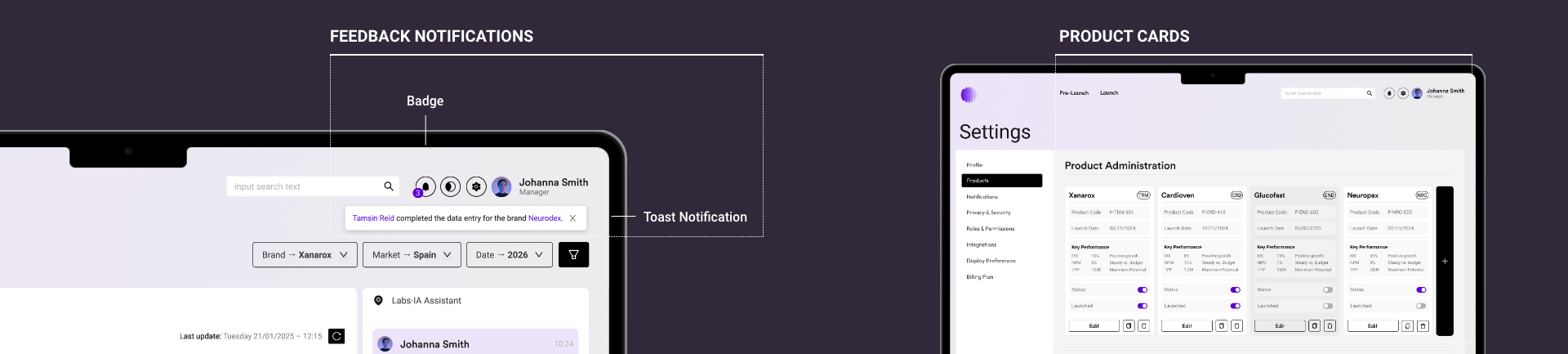
2023 – LabSafe Metrics by EDCR.ES
Methodology: Branding design, User-Centered Design (UCD), Design Thinking, Qualitative Research, Card Sorting, MoSCoW Prioritization, Minimum Viable Product (MVP) Definition, Lean UX, Iterative Design, Design Systems (Ant Design), Modular Design, Agile Principles.
Toolkit: Adobe Illustrator, Photoshop, Figma.

Introduction and Problem Description

Analyzing the pharmaceutical sector, we discovered that sales and marketing teams in pharmaceutical companies had difficulty visualizing and understanding data related to sales, stock, and campaigns.

Problem Detected: Upon initial contact with pharmaceutical companies and LabSafe Metrics itself, it was detected that data visualization was a significant challenge. The software used to access the data was old, unhelpful, and generated a high cognitive load. The project's goal was to create a UX/UI dashboard that would allow users to easily access data and make informed decisions based on it.

Research

The research focused on better understanding users' needs and expectations. Our objectives were to identify current user behaviors, determine necessary information for decision-making, and understand the optimal Information Architecture (IA).

Our methodology included:

  • Problem Interviewing: In-depth interviews were conducted with 10 individuals in pharmaceutical sales and marketing roles to uncover specific pain points and current user behaviors related to data management.
  • Card Sorting: We utilized an open Card Sorting activity during interviews, which allowed users to name and order the different KPIs, informing the logical structure of the dashboard.

This research enabled us to create a key User Persona, representing the central insight of the investigation. The fundamental need (Jobs To Be Done) that our design had to solve was encapsulated by the user's statement:

"When I have to analyse the resources that I need for a new launch, I want the information at one place for matching offer VS demand."

Defining the use cases and the MoSCoW method helped us prioritize the requirements for the Minimum Viable Product (MVP), ensuring we met this central business objective.

Solution and Information Architecture

The proposed solution was a UX/UI dashboard focusing on usability and clear visualization of sales, stock, and campaign data.

Modular Design and Card System: To optimize readability and manage high-density data, we defined a modular system with four distinct types of KPI cards (Percentage Graphs, Table-type, Horizontal Bar, and Raw Data with Comparisons).

Modular Design and Card System: To optimize readability and manage high-density data, we defined a modular system with four distinct types of KPI cards (Percentage Graphs, Horizontal Bar, Simple Data and Raw Data with Graphic Comparisons).

Interaction Design (Lateral Sheet): To manage complexity without interrupting user flow, clicking any card opens a Lateral Sheet that displays detailed, complementary information, keeping the user on the main dashboard view.

Internal Management: The solution included the Settings and Administration section for supervisory tasks: managing user permissions (roles), configuring languages/notifications, and managing product inventory (addition, editing, and archiving medications).

Modular Design and Card System: To optimize readability and manage high-density data, we defined a modular system with four distinct types of KPI cards... This modular design was also key for scalability, allowing the application to fluidly adapt from desktop screens down to smartphones while maintaining hierarchy and accessibility.

Brand Strategy and UX:
Credibility in the Interface
(Senior Value)

For a sales forecast Dashboard in the pharmaceutical sector, Credibility is the most critical UX factor. My experience in Senior Branding was applied to build a digital visual identity that conveys Trust, Precision, and Approachability, translating the brand's promise into functional interface decisions:

A. Brand Redesign and Strategic Typography:

Brand and Title Typography (Söhne Breit): A robust typeface family (Söhne Breit) was chosen for titles and the brand itself, projecting authority and solidity to reinforce the credibility of the AI data.

Interface Typography (Söhne and Roboto): Söhne was used for reading texts and, for implementation in the web app, Roboto from Google Fonts was selected. This choice was strategic and functional; Roboto has high compatibility and a visual resemblance to Söhne, ensuring accessibility and visual consistency of the system across any technological environment.

B. Color, Form, and Psychology of Approachability:

Approachable Forms (Curves and Rounded Corners) and Iconography: The use of rounded corners on data cards softens the interface. This, along with a clear and unified iconography, adds a touch of approachability and accessibility to the dashboard, facilitating the visual understanding of complex data.

Palette and Strategic Color Use: The palette was based on purple (associated with knowledge and high quality) and dominant white (for cleanliness and data focus). Strategically, the main navigation uses black to ensure maximum legibility and professional seriousness. Purple accompanies this navigation with small touches of color and emphasis (focus states), injecting an element of approachability, brand recognition, and warmth into the functional experience, without compromising precision.

Implementation and Testing

The dashboard was built and designed in Figma to enable testing. During implementation, delivery to the development team was facilitated, as the design was built entirely on Ant Design components. This minimized friction in the development phase and ensured the scalability of the web app.

Figma implementation allowed us to test critical flows, such as the onboarding process for new users and permission assignment in the Settings section. The design focused on simplicity to reduce errors in role management. Furthermore, the client suggested iterating the design for product management, transitioning from a simple tabular view to a Product Cards-based design, which made the administration of medications more visual, intuitive, and aligned with the brand strategy.

A key insight obtained from usability testing was the need for proactive, rather than merely reactive, data management. Therefore, the decision was made to iterate the design to include a robust system of personalized Notifications and Alerts.

This system was designed to operate on multiple levels:

1. Critical Pop-up Alerts: Emergent notifications (pop-ups) were implemented, designed to appear immediately on screen when critical stock or sales thresholds were exceeded (e.g., stock below safety minimum). This ensures immediate visibility and rapid user action in high-risk situations.

2. Configuration and Control Menu: An Alerts Settings section was included within the Administration panel. This functionality is crucial as it empowers the user to personalize their thresholds, frequency, and alert methods (email, in-app), transforming the dashboard into a tool that adapts to their specific decision-making needs.

3. Dark Mode: As an extra optimization detail added late in the project, a Dark Mode theme was implemented. This allowed users to switch to a darker interface palette, significantly reducing eye strain during extended work hours and accommodating specific user preferences.

This iteration not only improves usability but also enhances critical decision-making by shifting the focus from manual review to real-time alerting.

Results and Conclusions

The dashboard improved the efficiency of the sales and marketing team by providing clearer and easier-to-interpret information. It allowed the company to make informed decisions based on sales data, leading to an improvement in strategy.

Conclusions:

The project was a success due to the focus on user-centered design and attention to usability and accessibility. The dashboard significantly improved the user experience and enabled the company to make more informed and strategic decisions.

Key Learnings and Next Steps

Key Learnings:

  • User-centered research is fundamental to designing solutions that resolve real visualization problems.
  • Visual discipline (applying brand strategy for function) is critical in high-data-density dashboards.
  • Close collaboration between design and IT teams is essential to ensure effective and seamless technical implementation.

Recommendations / Next Steps:

  • Conduct usability tests with users to identify any issues or areas for improvement.
  • Adjust the dashboard design based on user feedback received.
  • Track results to measure the real impact on the company's sales and marketing strategy.